Whimping: A Display Typeface That Cuts Through the Feed
It was 3 p.m. on a Tuesday—two days before launching a new online course series—and I was tweaking the Instagram carousel for the teaser campaign. The first slide needed to stop scrollers mid-swipe: bold, confident, unmistakably *new*. I tried three clean sans serifs. Then I dropped in Whimping. Instantly, the headline didn’t just sit on the image—it leaned into the frame, held eye contact, and added subtle texture without shouting. Not flashy. Not chaotic. Just… present.
A Font With Intentional Personality
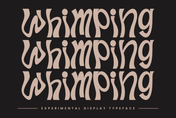
Whimping is an experimental display typeface—designed not for paragraphs, but for moments that need weight, warmth, and quiet distinction. Its letterforms balance geometric structure with gentle irregularity: slightly tapered terminals, soft curves on uppercase ‘S’ and ‘C’, and a rhythm that feels hand-informed but digitally precise. It’s neither cold nor overly playful—it lands somewhere between editorial confidence and creative approachability. Think of it as the kind of typeface you’d choose for a boutique film festival poster or a limited-run zine cover—not because it’s trendy, but because it communicates tone before the reader even parses the words.
Where Whimping Earns Its Place in Real Campaigns
In practice, Whimping shines where visual hierarchy meets brevity:
- YouTube thumbnails: At 120px width, its strong x-height and open counters keep “New Series Live!” legible—even when compressed or viewed at thumbnail scale on mobile.
- Instagram Reels covers: Paired with a muted background, Whimping’s subtle contrast adds dimension without competing with facial expressions or motion blur.
- Pinterest pins: Its character works especially well over lifestyle photography—soft enough to complement natural light, distinct enough to anchor text overlays without needing heavy stroke effects.
- Email banners & webinar headers: Used at 48–60px on light or dark backgrounds, it delivers clarity and brand cohesion without requiring extra shadow or outline treatments.
- Branded template packs: Designers can use Whimping as the consistent “voice” across quote graphics, launch countdowns, and course module labels—making assets feel unified, not repetitive.
It’s also surprisingly versatile for secondary text roles—like short subheads under hero images or campaign taglines beneath logos—where you want typographic continuity without sacrificing readability.
What Works (And What Doesn’t)
Whimping excels in display contexts: headlines, titles, logo lockups, social media callouts, and short-form emphasis. It holds up beautifully over gradients, textured photos, and semi-transparent overlays—as long as the background isn’t too busy or low-contrast. On dark mode previews or OLED screens, its balanced stroke weight avoids harsh glare or pixelation.
But let’s be practical: it’s not built for body copy. Don’t drop Whimping into email newsletters as paragraph text, or use it for pricing tables, feature lists, or multi-line product descriptions. Its charm lies in restraint—not density. Likewise, avoid using it below 24px in UI elements or app notifications. And while it handles short multilingual phrases well (basic Latin + diacritics included), check the font files for extended language support if your campaign targets broader regions.
Smart Pairing Keeps It Grounded
Whimping gains strength through contrast. My go-to pairing is a neutral, highly legible sans serif—like Inter, Poppins, or even system fonts like SF Pro or Segoe UI—for all supporting text. This combo lets Whimping carry the brand signal while keeping information scannable. For editorial-style campaigns—say, a blog series or newsletter header—I’ll sometimes layer it with a warm, low-contrast serif (e.g., Literata or Cormorant Garamond) for subheads, letting Whimping own the top line only.
Avoid pairing it with other high-personality fonts—no scripts, no distressed display fonts, no ultra-thin moderns—unless you’re deliberately designing for irony or deconstruction. Whimping doesn’t need competition; it needs context.
Before You Drop It Into Production
Always verify what’s included: most Whimping licenses offer at least one weight (often Regular or Medium) plus stylistic alternates—like a more condensed version or alternate ‘g’/‘a’ glyphs—that add nuance without switching fonts. Check file formats (WOFF2 for web, OTF/TTF for design apps) and confirm commercial licensing covers your use case—especially if you’re building templates for resale, embedding in digital products, or using it across client ad campaigns.
Also test rendering across platforms: Whimping looks crisp in Figma and Adobe apps, but preview how it appears in Canva or email clients if those are part of your workflow. Some display fonts behave unpredictably in older iOS versions or Outlook desktop—so always check mobile previews before finalizing.
At its best, Whimping isn’t about being “noticed.” It’s about being recognized—as intentional, human-scaled, and quietly confident. It won’t solve weak messaging or poor layout—but in the right campaign moment, it helps your words land exactly how you meant them to.